blending art and science
Art For Communication

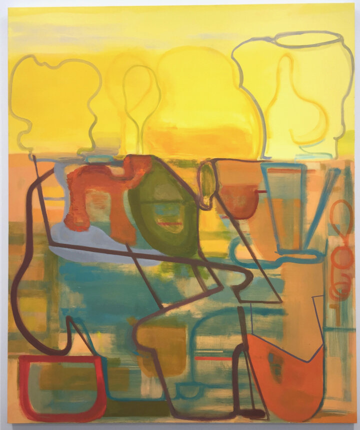
Installation view of Elizabeth Hazan: Heat Wave at Johannes Vogt Gallery, New York (all images courtesy of Johannes Vogt Gallery)
Cool Science brings together young artists, mentors, community members, and researchers to explore extreme weather through science and art.
In Cool Science, art isn’t just about making amazing pictures. It’s about using your art to teach people about the science behind extreme weather.
Art is meant to grab attention – it engages people. Once engaged, artworks are meant to hold attention so viewers absorb and think about what they are seeing. Engaging, holding attention, and compelling thought and further conversation with others are some of the ways that visual art conveys ideas in important, humorous, powerful, subtle, and often multiple meanings, through forms that can be deeply felt.
The information below will provide you with some tips about designing your artwork. If you need more information about the science behind extreme weather, visit the extreme weather page.
How do artists get people’s attention?
Think about when you’re in a car, on a bus, or out walking. What do you see on street signs? How about billboards or signs in store windows? What makes you notice these things and how do you know what they’re trying to tell you? Artists use a number of methods to get your attention and keep it.

Elizabeth Hazan, “July” (2019), oil on linen, 60 x 50 inches

Elizabeth Hazan, “The Forest at 2 am” (2019), oil on linen, 50 × 47 inches
Elizabeth Hazan, Field #71, oil on canvas, 20" x 16"
Color
Color is an important part of any art project. Tactics such as contrast can create emphasis and visual impact and can improve readability.

In addition, certain colors are associated with different meanings. For example red is often used to convey concepts such as heat and danger, while blue is often associated with water or calm, and green can symbolize ideas such as money, nature, and safety.
Words, Images, and Symbols
Using images, words, and symbols requires you to envision your ideas, bringing your thoughts, feelings, understanding of relationships between concepts, and goals together. For example, a yellow road sign with a curved arrow suggests one should use caution because the road bends. A red sign with the word “Stop” gets drivers’ attention and includes a clear message about what needs to happen.

What company logos do you see around you? Logos are often excellent examples of ways in which an artist has been able to show a complex idea simply through the use of lines and shapes, words and symbols. Think about the colors, shapes, and fonts they use. What do those say about the company or its products?

Scale
Scale refers to the size of a design element in relation to other elements as well as the available space. You can use scale to emphasize an idea, create balance or imbalance in your art, and create contrast.


Paris Street; Rainy Day; 1877; Gustave Caillebotte. Art Institute Chicago
Lettering & Type
The type of lettering you choose can impact readability, importance, mood and tone, movement and other concepts.

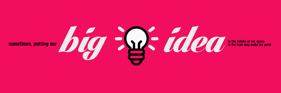
For example, if you’re conveying movement, you might use italics. If you’re conveying something bold and assertive, you might use bold lettering or all capital letters. Tall and skinny ideas—about trees, perhaps—might call for using tall and skinny lettering. Ideas that involve connectivity might benefit from a cursive font where the letters are also connected. The size of your text can also key viewers into what’s most important—for example, you could put the big idea in large font, with the supporting details in smaller fonts. Play around to see what works best for your message.

Repetition & Patterns
Repetition and pattern involve one object/shape or combination of objects/shapes to be arranged in a way that reoccurs. The use of repetition and patterns can convey consistency and stability or can be disrupted or altered to show a change. The way you arrange your patterns and repeat objects can also be used to convey ideas such as movement, size, and time.


What should I think about when designing the layout of the artwork?
First, there are specific size requirements for the contest. Visit Artwork Guidelines for more information.
Working within the required size and orientation, here are some tips/things to consider when laying out your poster:
Order of Objects
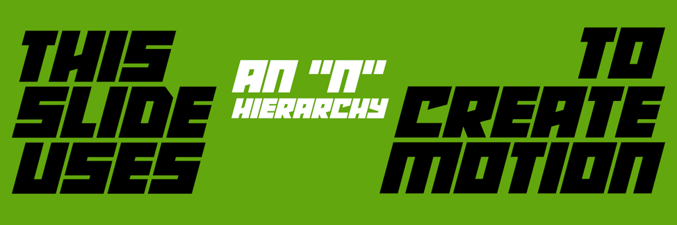
The order in which you arrange the elements on your poster are important: It helps you establish a visual hierarchy and ensures readability.

You can look at the layout of comics as an example of stories being told over the course of sequential panels where artists use thought bubbles, frames around images, and other tools to tell a story.
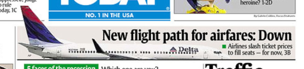
Or newspaper headlines, where they use large fonts, bold phrases, and sometimes big bold images.
Websites tend to use big bold images and large fonts too in order to get your attention, like this Cool Science website.
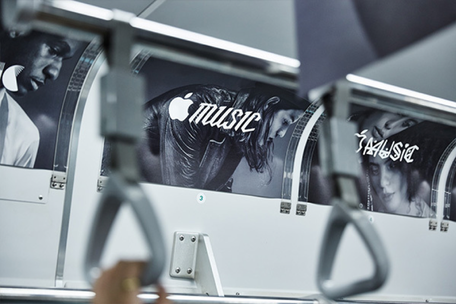
Sometimes, artists let the images take center stage and use minimal text, like this Billboard from Nike.

Examples of different types of ways to organize your material are in the images below:


Balance of Objects
You want to ensure that your artwork is balanced in a way that allows it to be seen and understood quickly—even from far away.

Pulling it All Together
You can combine the different design elements for visual impact:

What process can I use to develop my artwork?
Investigation, which can include planning, exploration, research, and interpretation through the art-making process, allow you to try on ideas freely, to find connections between ideas by joining them together, layering them, or placing them next to, above, or below one another, and to refine your thinking by re-drawing, re-placing, and re-organizing the images from one draft to the next.
Thinking visually is a time-tested method for realizing what we are thinking; artists discover things they hadn’t known they were thinking and make ideas clearer iteratively by manipulating them over time.
The “COLDER” approach below shows the steps you might take while creating your art:
Collect and Condense – Do your research on the science behind extreme weather. What concepts are helpful in answering the challenge question you’re interested in? What images do you see? What stories do you imagine? Because art can be personal, messy, focused, layered, ambiguous, flowing, and responsively organized, review of the most interesting images and words created as the development process unfolds makes the ideas readily available to pluck out for further development and thinking.
Organize – Gather the ideas, examples, stories, facts, and feelings you’ve collected and start to organize them – do they fall into specific themes? Are there elements that you like or don’t like?
Link – How are the things you’ve organized related or unrelated – to each other, to the challenge question, to the science of extreme weather, to artistic strategies?
Develop and Question – Use the things you’ve gathered and organized, and the links you’ve uncovered to start pulling together your artwork. Think about fonts, patterns, scales, color, placement, and other appropriate design elements.
Expand and Envision – Show your artwork to others. Ask them what they think your art is saying and why. Listen to their feedback and ask questions to figure out how you could improve your art.
Revisit, Revise, and Refine – Based on the feedback you receive, make revisions to clarify the meaning of your artwork and produce the final piece for submission to the competition.